BACKGROUND
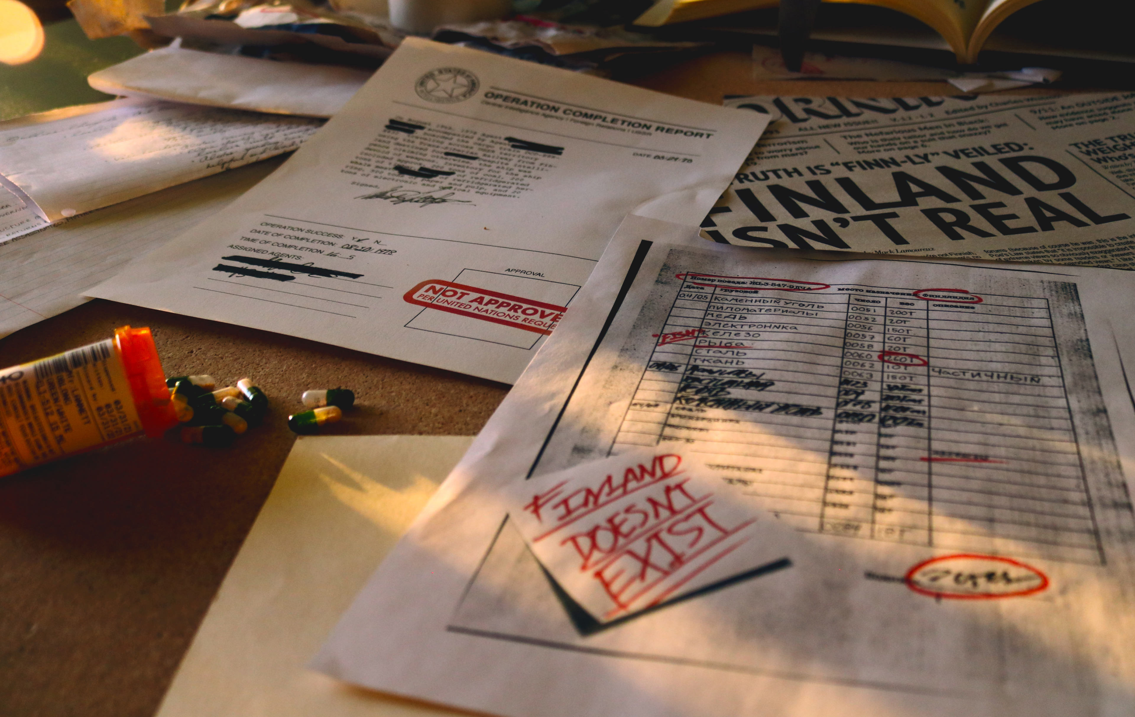
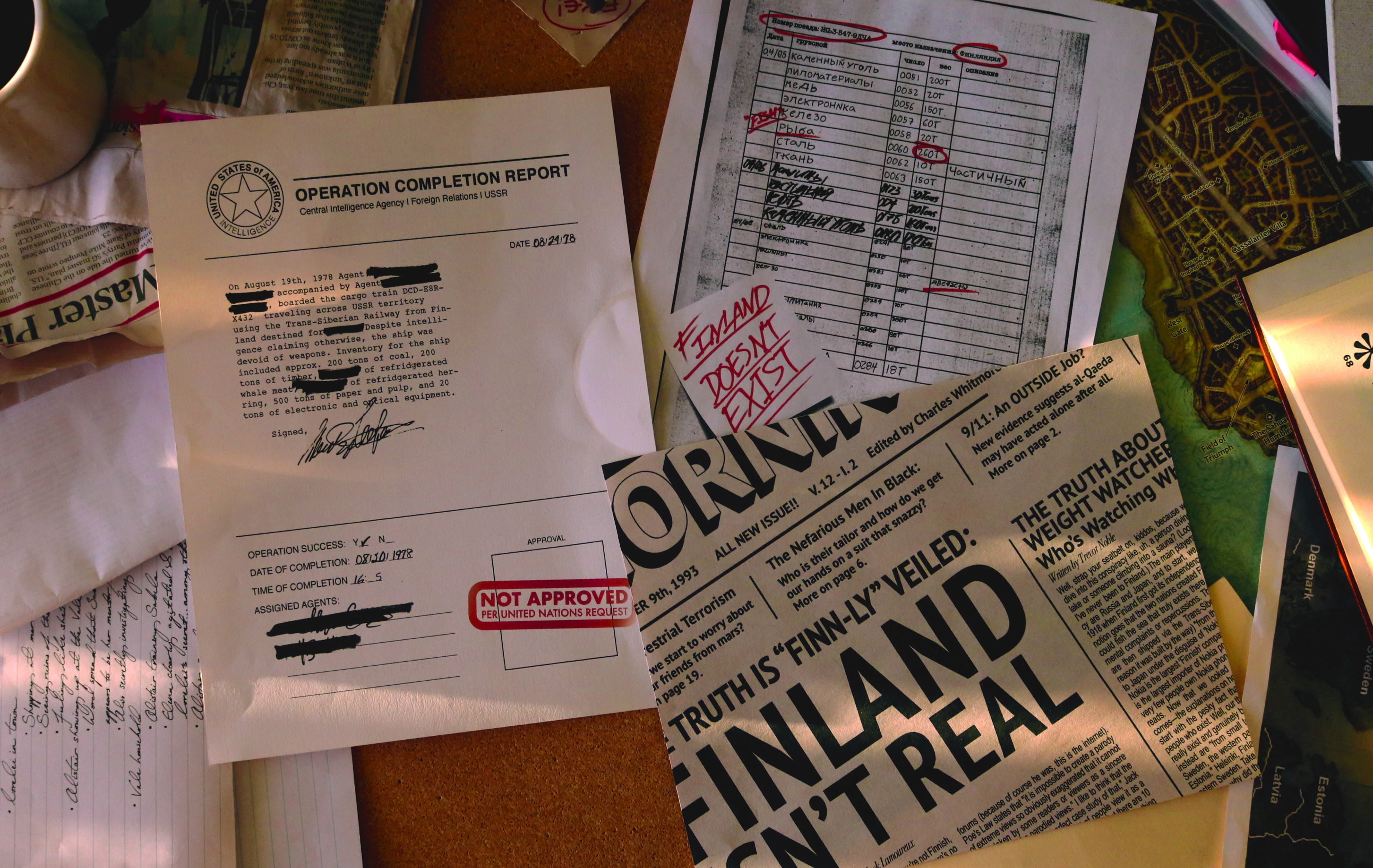
Possibly more than any other project I’ve faced as a designer this is the one that came the closest to breaking me. I was entering my second year of design school in my mid-twenties while working full time and was still woefully uninterested with anything having to do with formatting typography (I know, excellent choice in career path Daniel). Now, I can’t blame my professor, he tried his best to make this assignment as fun as possible, but as any designer will tell you there’s only so much one can do to make designing documents an exhilarating experience. In the end however, after many hours laboring over the intricacies, not only did I design the earliest piece I still consider portfolio worthy, but grew exponentially as a designer as well.
PROCESS & TECHNIQUE
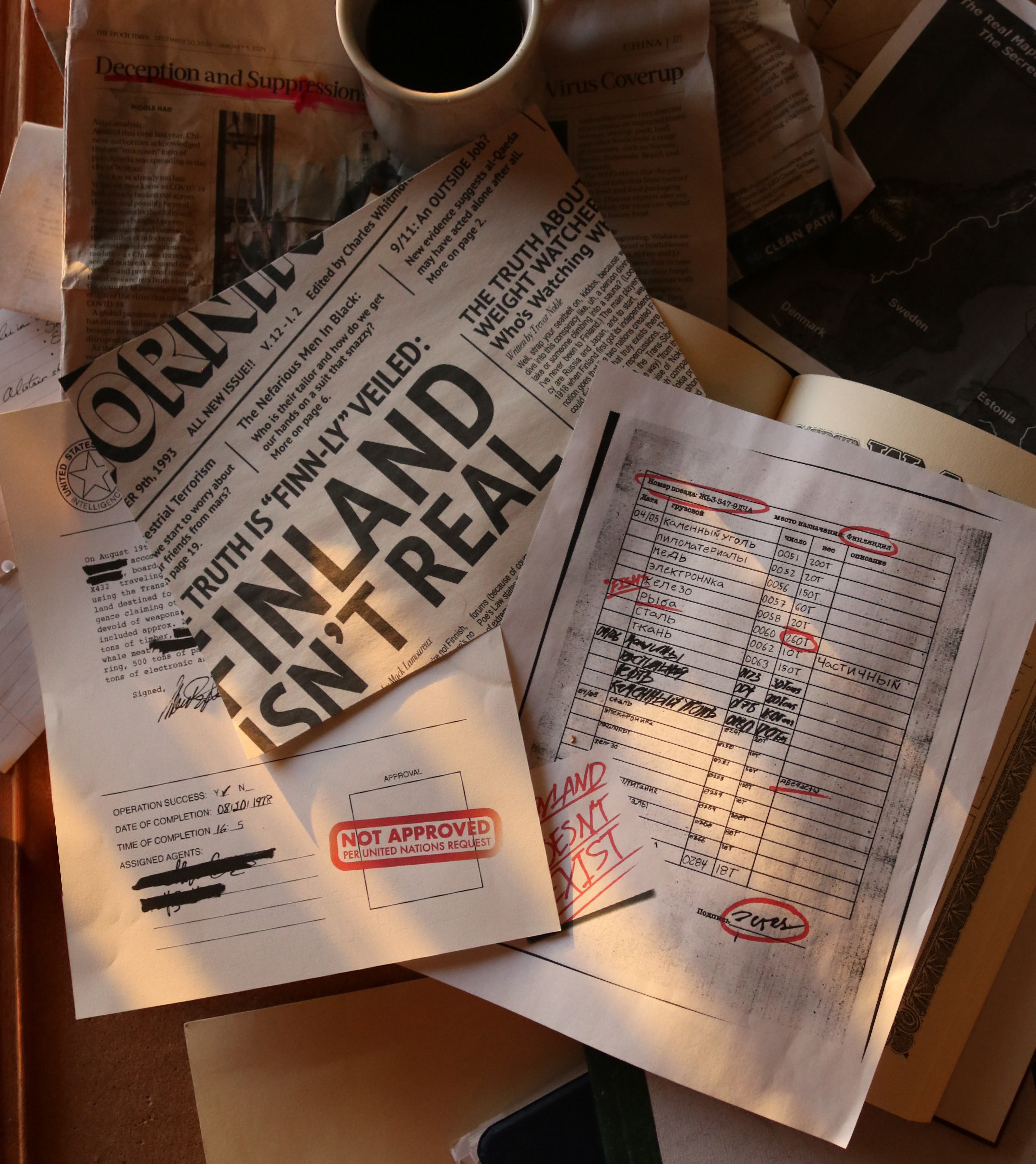
This was the first project where I stepped outside of the box and made use of the assets at my disposal to create something that felt gritty and tactile. I asked my roommates for handwriting samples, wore down old sharpies to the nub, and used an actual xerox machine to achieve that iconic texture. I studied historical documents from the Cold War era and World War II, copied signatures, and tested a wide range of techniques to capture their iconic feel. Each composition was printed on paper that complimented their respective design (newsprint, xerox paper, and old watermarked stationary).
TYPEFACES: American Typewriter, Arial, Bodoni, Courier, Helvetica, PT Sans
COLOR SCHEME: