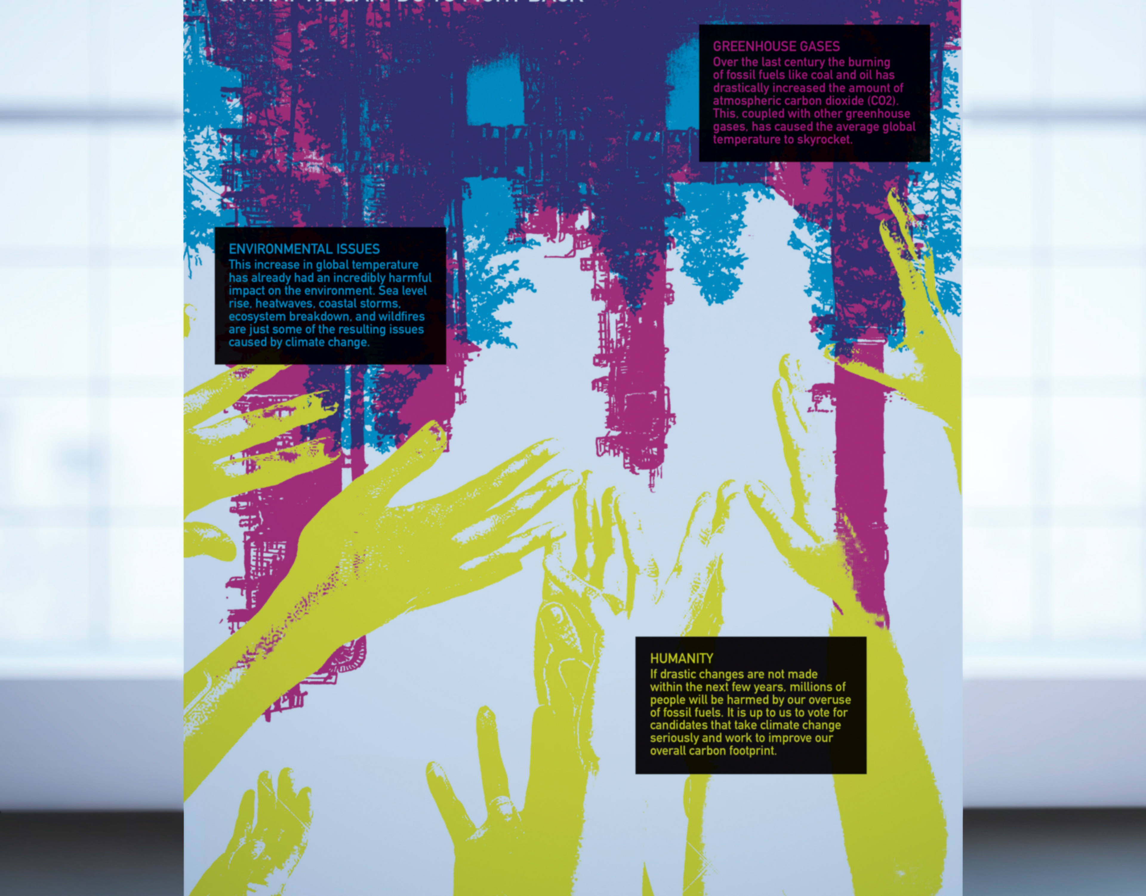
BACKGROUND
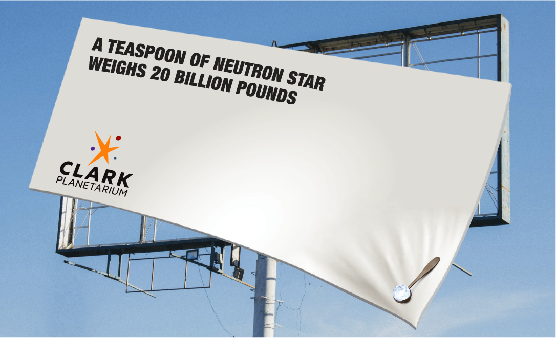
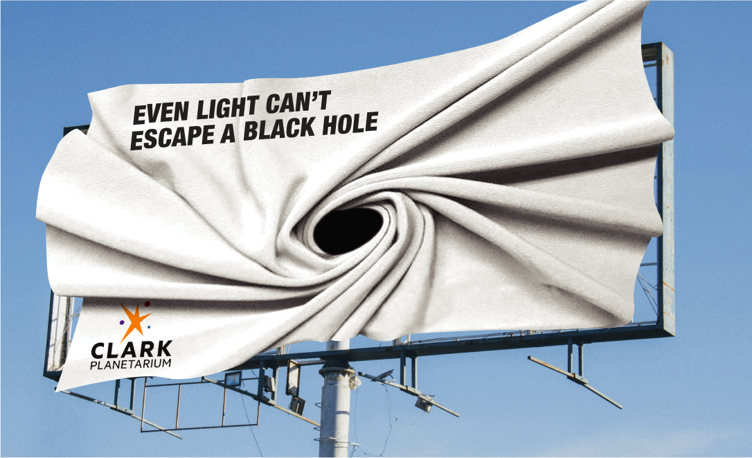
For this Advertising Design assignment, we were tasked with creating two outdoor advertising mockups for one of three prospective clients: Jeep, Vans, or Clark Planetarium. I’ve always been a huge science nerd and many of my fondest childhood memories involve me visiting the Planetarium growing up, so I thought it would be interesting to take a crack at a design that encapsulated that childhood wonder.
PROCESS & TECHNIQUE
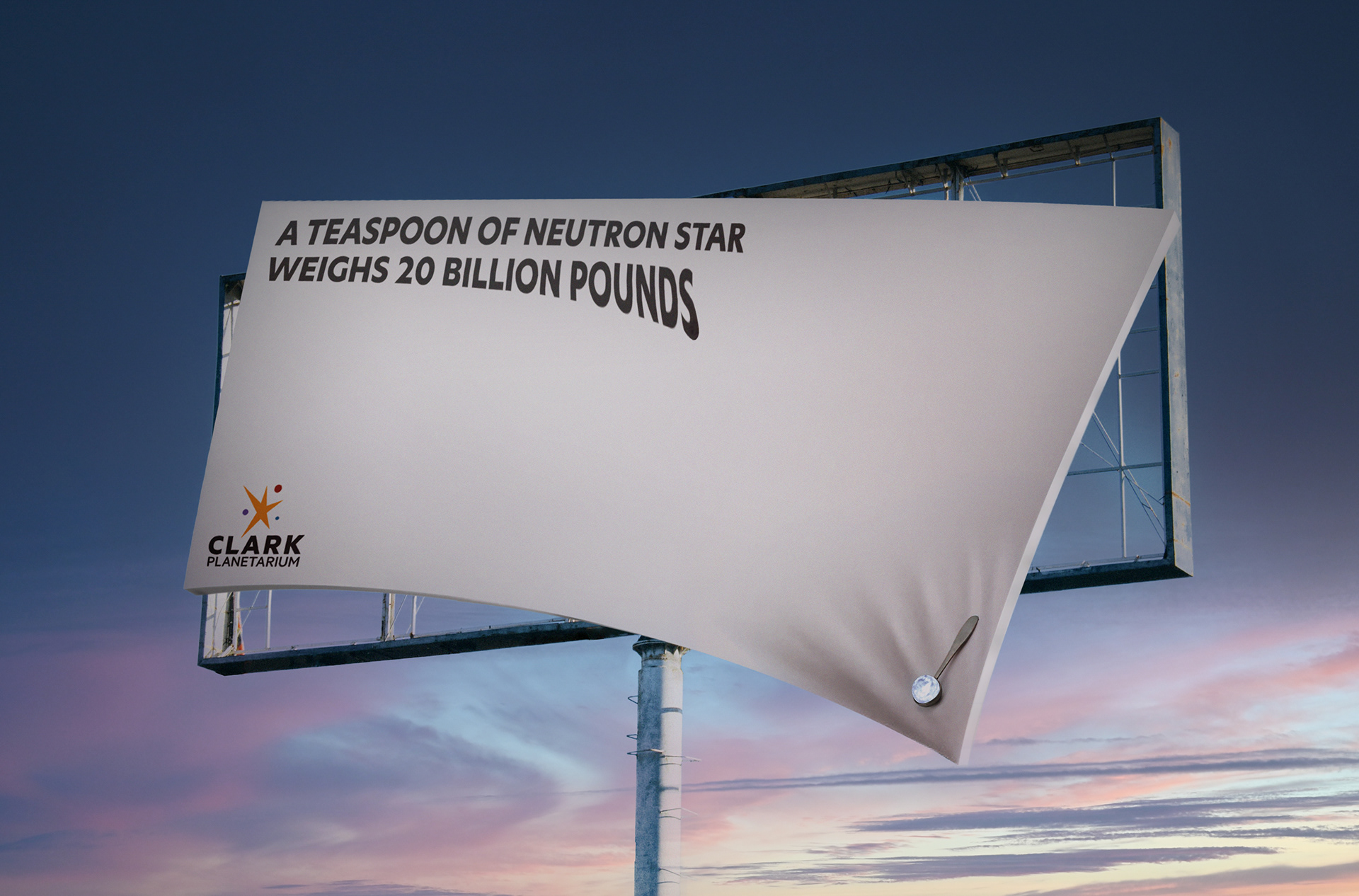
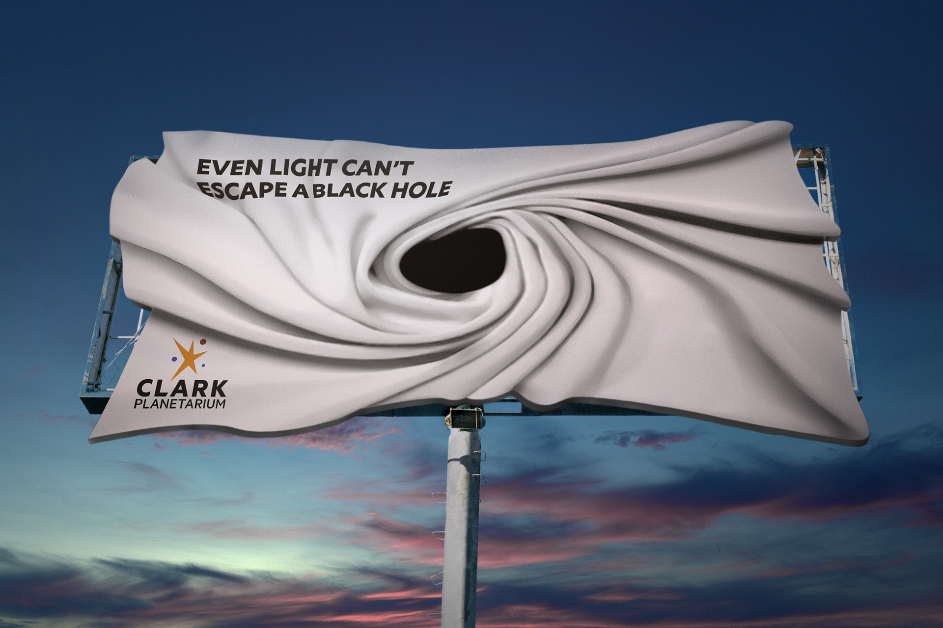
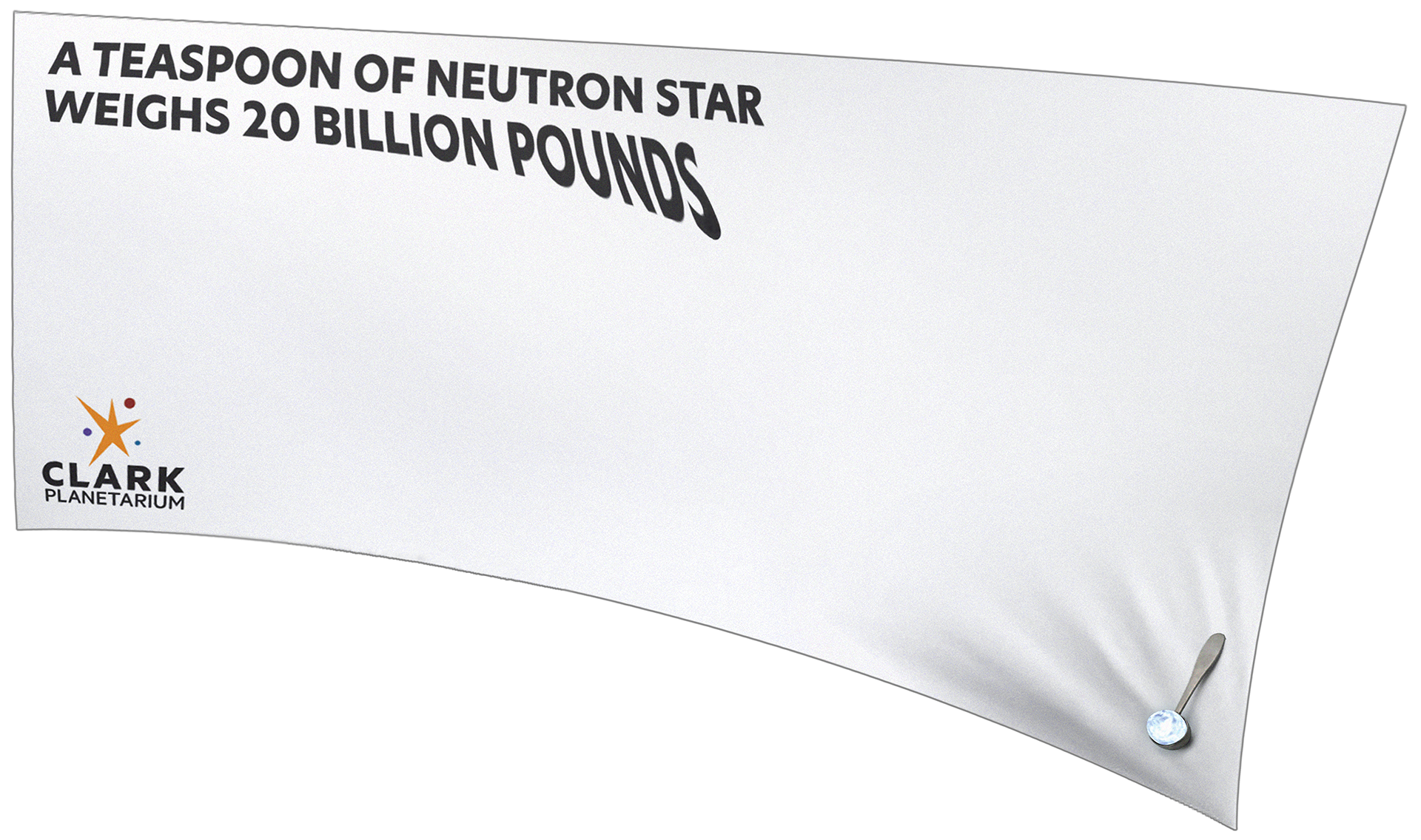
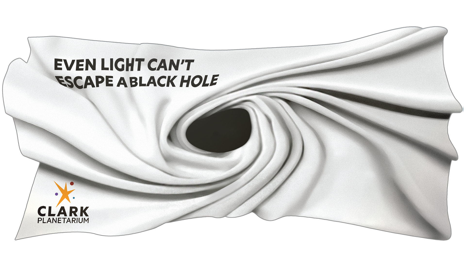
Early into this project I saw the potential to use Clark Planetarium’s linchpin themes of astronomy and physics to break the typical rectangular format and push the boundaries of the billboard medium. It was also important to me that the final design grab the attention of both parents and children driving on the high way, conveying the intended message quickly and effectively while also leaving viewers with that same sense of child-like wonder.
TYPEFACE: Museo Sans 900
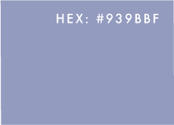
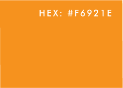
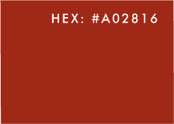
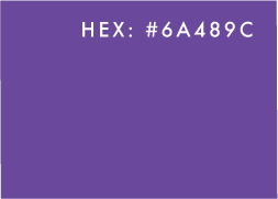
COLOR SCHEME:

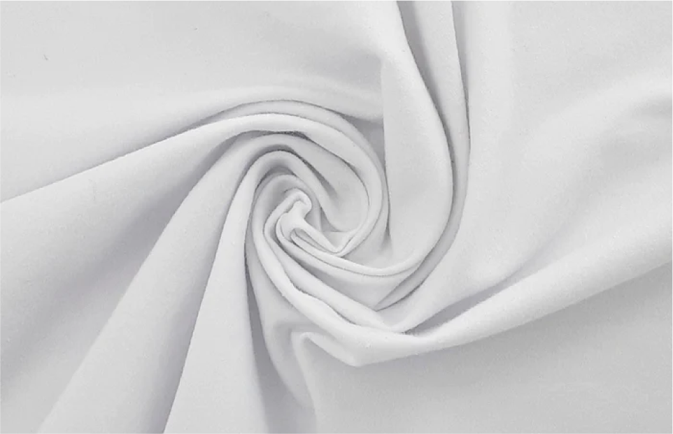


TEXTURE ELEMENTS
Knowing the direction I wanted to take, I began by photographing a plain white sheet I'd twisted and stretched to create the desired textures. Although I was satisfied with the results of the twisted texture, the stretching effect proved more difficult to accomplish, and I eventually resorted to incorporating images I found online for that particular texture.
MOCKUP BACKGROUNDS
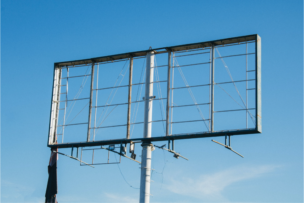
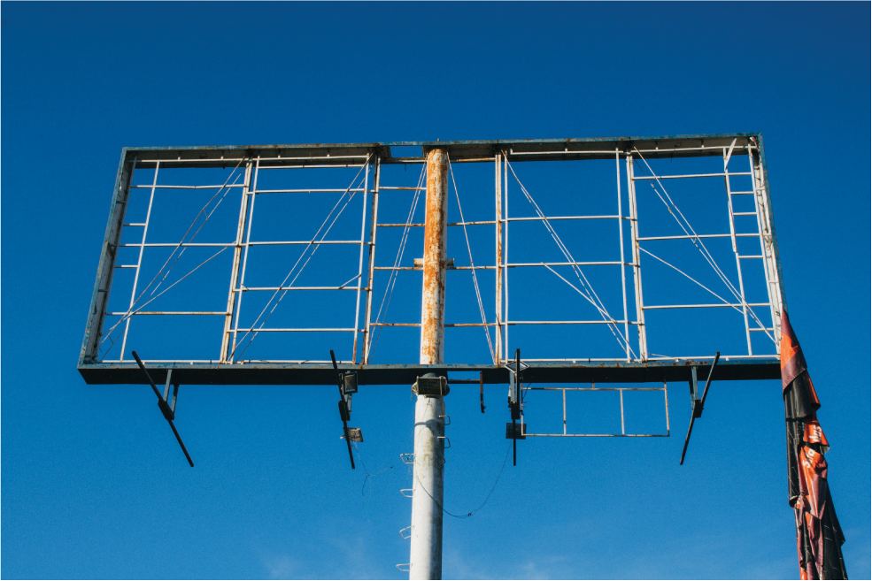
As you can probably imagine, it's difficult to find ready-made mockups of billboards for a design which unapologetically breaks the typical rectangular format, so I knew I'd have to edit something from scratch. Fortunately I was able to find these two high-quality photos of a (mostly) unadorned billboard, and set about cleaning them up to place my design over top of them.
ROUGH CONCEPTS
My initial experiments resulted in these original rough drafts. While compiling my portfolio much later, I would revise these original concepts, incorporating the second image of the same billboard from a different perspective (above) and adding a more cinematic sunset backdrop for the final composition.