BACKGROUND
Emma Zhang, at the time the Senior Brand Experience Designer at Adobe Inc. in San Francisco, was one of several notable designers I learned from directly as part of a series of guest designers at the University of Utah. As part of her workshop, she challenged those attending to choose three emotions from an emotion wheel she provided, come up with a short list of “rules” for the assignment, and what the desired outcome would be. The answers to these prompts were then used as a rubric which would then be handed to one of the other designers in attendance to complete.

ORIGINAL RUBRIC
For this rubric (provided by my peer "Blake") I was given “anticipation”, “optimism”, and “surprise” as my three emotions. The rubric tasked me with creating three simple animated compositions using only one variable typeface, all patterns had to be from auto-generated artwork websites, and all type had to be overlaying on some other element (i.e. type, image, pattern, etc.).
PROCESS & TECHNIQUE
As per the rubric, all of the patterns in each of these GIFs were created using randomly generated artwork from a variety of different websites (unfortunately the exact websites I used are lost to time—for whatever reason I wasn't required to name them for the original assignment and the generative art scene has moved so quickly in the past few years that many of these sites are either unrecognizable or gone by now). Boucherie Block's playful-yet-rigid structure stood out to me as being uniquely capable at conveying all three emotions nicely. The words in each GIF were strategically chosen to reflect their corresponding emotion while simultaneously having tangible alternate meanings.
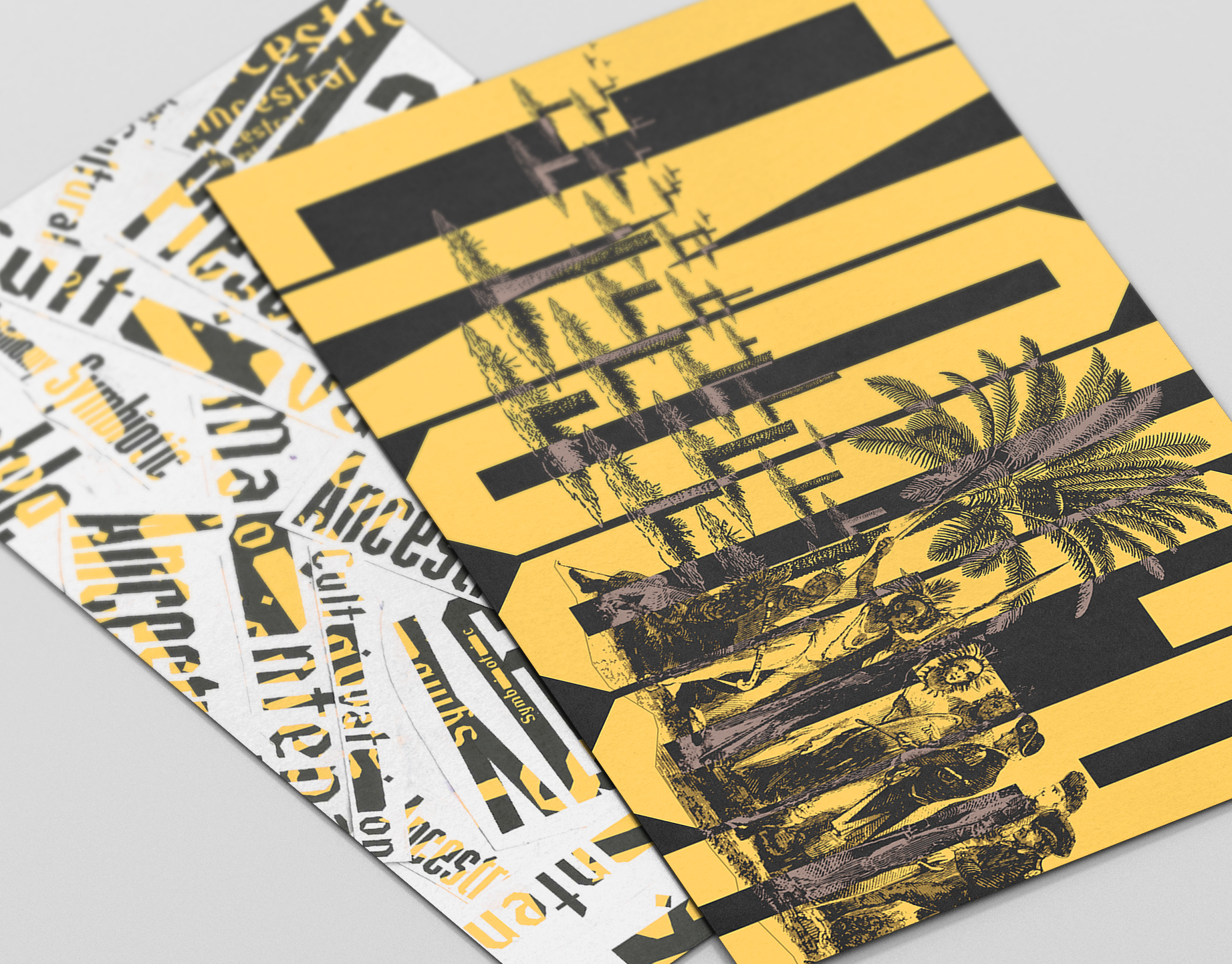
TYPEFACE: Boucherie Block

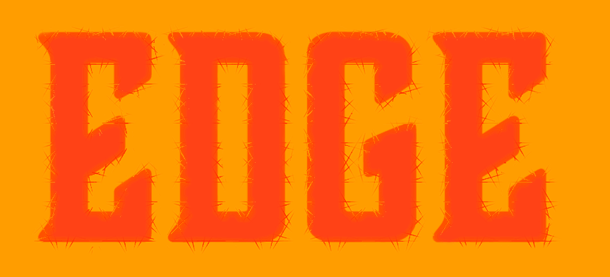
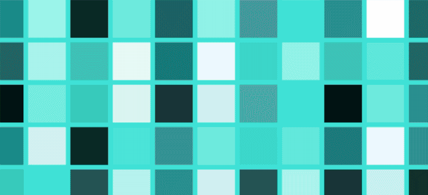
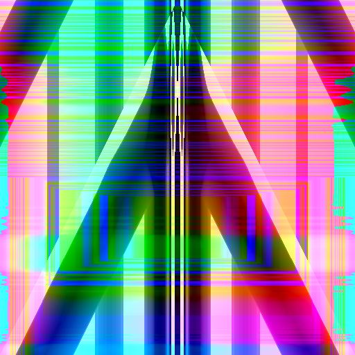
"EDGE" DESIGN ELEMENTS
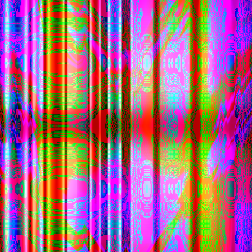
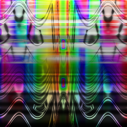
This generative art website was designed in a way that allowed me to "animate" the composition by simply dragging the various sliders while running a screen recording through Quicktime. I then converted the mp4 file into a gif and uploaded it to Photoshop. From there I was able to alter the coloration and use a series of masks to develop the prickly texture on the outside of the type to reflect the sense of anticipation.
Although the final moments of the original gray gif are certainly interesting and something I originally wanted to include, I ended up cutting from the final design due to it standing out too much and because I wanted to make the gif easily loopable.
Although the final moments of the original gray gif are certainly interesting and something I originally wanted to include, I ended up cutting from the final design due to it standing out too much and because I wanted to make the gif easily loopable.
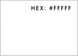
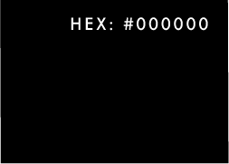
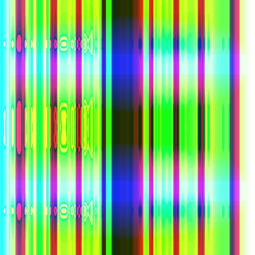
COLOR SCHEME 1 ("EDGE"):

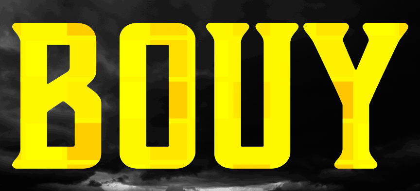
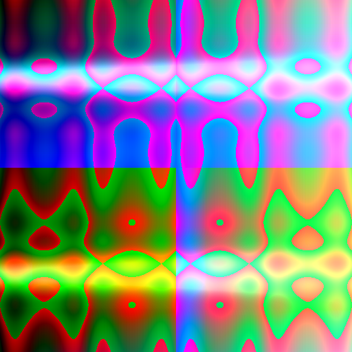
"BUOY" DESIGN ELEMENTS
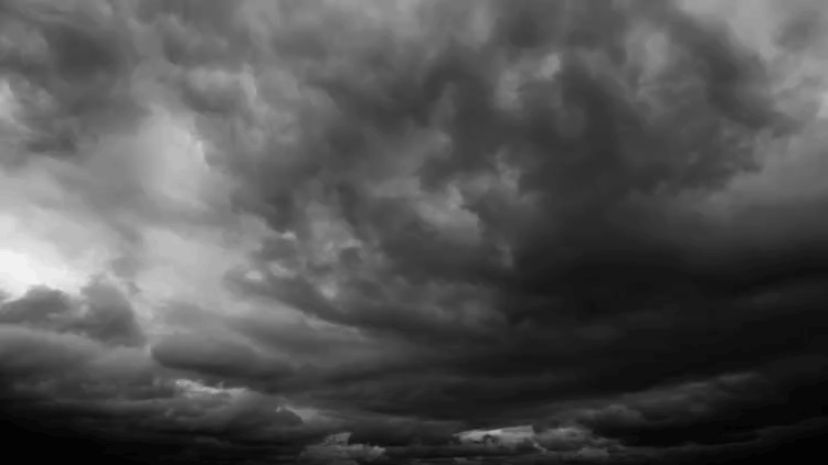
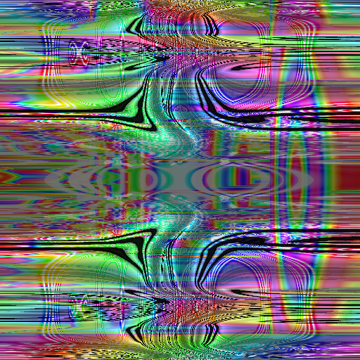
I have to admit that I technically bent the rules here and there is a pattern in this gif that isn't actually auto-generated: the stormy background (which is obviously just a stock video). That being said, the pattern within the text was created by compiling just under a thousand screenshots from an online art generator into a single gif. From there I compiled the files in photoshop and, after applying all the desired masks, added in the yellow color of the text to contrast with the background and unify the overall composition.
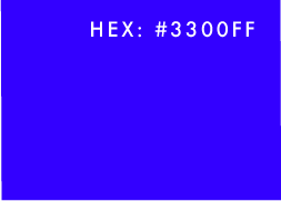
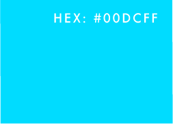
COLOR SCHEME 2 ("BOUY"):
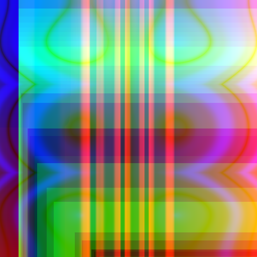
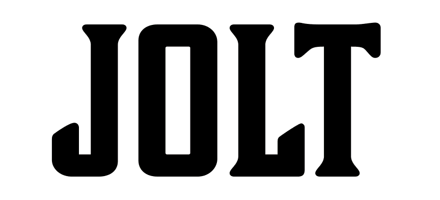
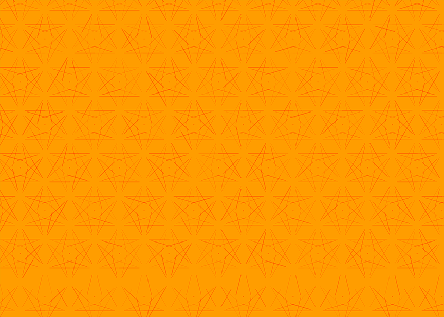
"JOLT" DESIGN ELEMENTS
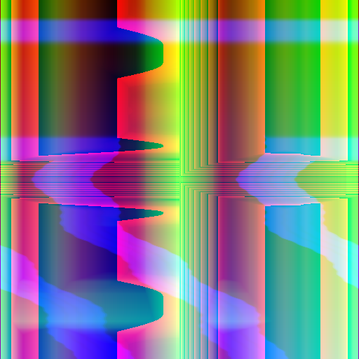
Comparatively, this final gif was relatively easy to put together. Knowing that most of the gif would be as plain as possible to contrast with the intended "surprise" effect, I simply had to place the text onto a white background. From there I compiled these eight screenshots, placing them on top of the text on different frames and experimenting with the different overlay controls for each until I was pleased with the result.
COLOR SCHEME 3 ("JOLT"):