BACKGROUND
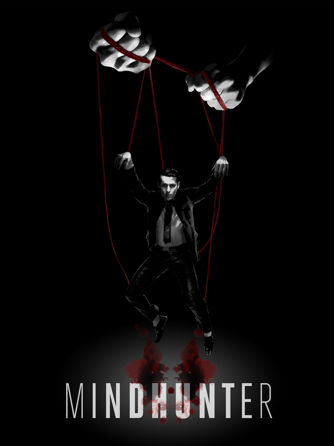
This was one of my favorite assignments during my time at the University of Utah, allowing me to explore new design techniques while referencing existing themes from one of my favorite shows on television. The assignment was to design a poster for a movie or TV series of our choice, and after sketching out a few options for both Mindhunter and Better Call Saul, this idea just became too perfect for me to ignore.
For those of you who don’t know, Mindhunter was a Netflix series loosely based off of the real life experiences of FBI agent John E. Douglas, who investigated and interviewed serial killers and mass murderers throughout the 1960s to the 90s, developing criminal personality profiles to assist with tracking down killers in the future. As you can imagine, the more Agent Ford attempts to get into the head of these killers, the more he finds that they’re getting in his head as well, which was the idea that served as the primary inspiration for this poster.
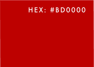
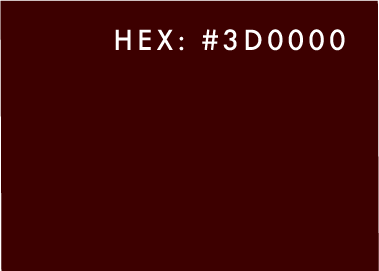
COLOR SCHEME:
PROCESS & TECHNIQUE
I started by writing down a list of words I associated with each show, then took those ideas and incorporated into several thumbnail sketches. Once I’d decided on my composition, I found some string and took a collection of photographs using harsh lighting from below. These photographs were then compiled with a collection of images I found online to form the rough draft. From there I used the Levels tool to create several distinct layers representing the hierarchy of light, finishing by painting in the red on the strings.